Winning Combination | Creating Comfort with Color, Pattern, and Texture
Your Home & Lifestyle Magazine
Imagine entering a room without any color, pattern, or soft texture in it. Perhaps it’s akin to an Apple store with glass walls, sleek flat surfaces, white-on-white, and metallic finishes. It would probably feel a bit chilly, even if the thermostat was set at a balmy temp, no?
For emotional reasons as much as tactile ones, humans tend to gravitate to softer textures and the visual comfort of color and pattern . . . similar to the way a cat would rather curl up on an old bed quilt than a stainless-steel floor. Like water, comfort is a primal need. People have reportedly used animal hides as shelter since the Paleolithic era, after all. A yen for comfort is in our bones.
But for those of us who lack a natural eye for design, it can be difficult to suss out exactly how to combine patterns, colors, and textures in decor without clashing. Do it wrong, and you might feel like you’ve created a visually loud interior that reads as too much. Even professional designers can struggle with this, but they’ve developed step-by-step advice that can help the rest of us.
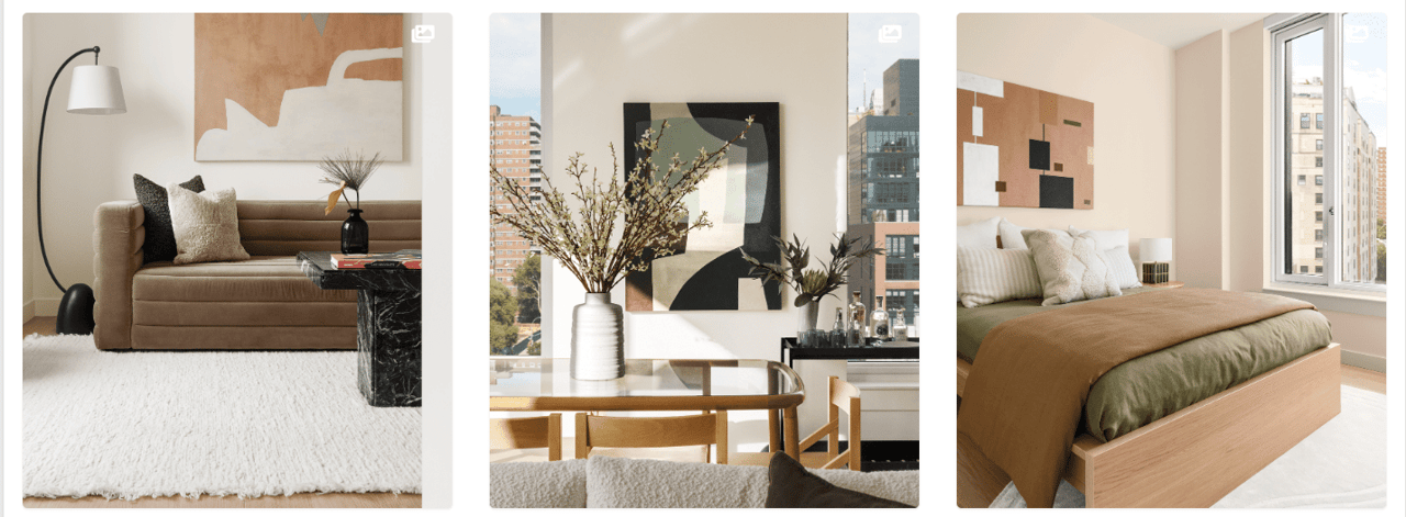
Tip number one? Fear not. “We always like to embrace creativity because there’s so much more room for it than people often believe,” says designer Porter Hovey, cofounder of Brooklyn, New York–based Hovey Design who recently designed the apartments at Chelsea Canvas with that tenet. “Don’t be afraid to go big and bold with visual intention in mind.” She advises layering each space, which “adds personality to the home as soon as you step inside.”
If you’re concerned about whether different patterns and textures will coordinate, you’re not alone. “A lot of homeowners struggle with furniture and what tends to look good together,” says Hovey. There are two major things that can help. The first is limiting your selection to natural hues (the earthy browns, sky blues, and verdant greens beyond your windows will always “work” together) and seeing and touching samples in real life before investing in upholstered pieces. Because digital screens display colors in different ways, that subtle motif or woven basket that you’re loving on Pinterest may look altogether different when it arrives at your door. That’s why holding a sample in your fingertips can be a prescient move before making any major purchase. And arranging potential patterns, colors, and texture samples on a table to see how they coordinate (or don’t) can go a long way toward knowing what plays together well.
It’s also wise to employ a mixture of both clean-lined and softer choices in every space you decorate. For example, you may place round bolster pillows in a soft floral print atop a boxy striped tuxedo sofa; used together, they make the different aesthetic personality of the other sing. Hovey recently placed a soft ash-brown velvet sofa adjacent to a smooth black marble coffee table, which serves to “highlight this idea of hard versus soft,” says the designer. “We highlighted the fixtures throughout the unit with this idea in mind. The black details along the kitchen storage with the light wood of the kitchen.” The results are like a design version of comfort food: warm and delicious. “Incorporating textures into your apartment design really adds depth, warmth, and visual interest to the space,” says Hovey.
-
color clues.
In a world where rainbows exist, there are no don’ts when it comes to colors; but designers often highlight the following as good tips to keep in mind.
Do: Pick a color with meaning. You will love living with a color more if it has a story behind it, such as a shade of green pulled from your ancestor’s antique oil portrait.
Do: Try to coordinate a room. Spaces tend to be more soothing if there is a fairly cohesive color palette within. Too many colors in one space can feel a bit like the orchestral warm-up at the symphony: cacophonous.
Don’t: Be scared. If you want to try a bolder color, go for it! Begin by painting an accent wall or splurging on new bathroom towels in that hue, for example. A small investment and the flexibility to change will give you the freedom to experiment.
-
Photography by Streetsense, Vladdeep/iStock/Getty Images Plus.
YHL/ Written by Kathryn O’Shea-Evans